Sunday 23 November 2008

Illustrator Brief

We had to further develop the typeface we made for our assigned partner, in my case Carl, in Illustrator. Now, I'm Illustrator self taught, and it was a little bit of a drag sitting through several hours of Illustrator sessions. Though, I did learn a couple of nifty tricks that were pretty interesting, though still. Two hours.

Anyway, this is what the A1 poster looks like. As you can see I've put the typeface into the proper Space Invaders game layout, and I really love how it turned out. The original Space Invaders game was green on black, but I changed it, obviously, to be yellow on black, because that most definately fits in with the whole CMYK restrictions of the brief, no doubt about it.

How nifty is that? I'm pretty chuffed with that, if I do say so myself.

-HJ x

Stina Persson

Stina Persson is one of my favourite artists, and as you can see from the work below, it's simply beautiful. I may, or may not, have mentioned before that I love working in all kind of materials, paints, inks, pastels, you name it.

I came across this artist in a book called...Illusive, I believe, a year or so ago at my last college and fell in love with the technique. I rushed out and bought masking fluid, that's safe to say.

Persson works with cut paper and inks, though my favourite of her styles are her watercolour pieces, some of which are shown below. She masks areas off and then just goes nuts with the paint, and it's same to say that the result is amazing.


I even tried to adapt the technique myself, and wow is it a messy job. After lots of failed attempts and lost of mess, I finally came up with ine that worked, and here it is!


Obviously it's a lot cleaner and sharper than Persson's technique, but I'll definately be giving this one more work in the future. It was good fun. I look wierd in watercolour.

-HJ x

10 Letters

So in my first post to this blog I mentioned how terrible my first attempt at this project really was, so I redid it for my module deadline, which is tomorrow, eek. Anyway, my word was 'deconstruct', and I think this typeface fits the bill much better, because it's based on glyphs made out of lego. For some reason, I couldn't get the picture any bigger, but you get the general gist of it.

Enjoy, y'all.

-HJ x

Wednesday 12 November 2008

Visual Literacy Week 2

So the second week of visual literacy rolled around, and there was more cutting and sticking. Also, the Randomizer made another appearance, except there were two. :O.

On yellow, we had to write five adjectives, cut them up, fold them up, and stick them in the box, and on blue we had to write five verbs and do the same. Then we picked one of each and had to visually represent it on A2 off-white using the primary colours. The first ones I pulled out were Destructive Fall, and that is represented in the right of the image below of a dude falling down a cliff. I finished it pretty quick and so picked two more out of the box. I got Excited Jump, which was essentially the same, only backwards. So I decided to try be clever and do the same image, but with the guy jumping back up the cliff. They ended up being pretty sweet, but because the figure was in yellow, he was a little difficult to see. The direction of the letters kind of helps though.

And then somebody had to pick an animal, and someone chose Bear. We then all picked an adjective to represent. I ended up with fat, can you tell? He's split his stitches. Loz got drunk, and that was such a good picture, but I couldn't get a photo.

And then we had worms, which was, to be honest, really easy. For this one, we had to pick a verb. I got jump, and this is what I came up with.


These are some of the images that the rest of the class came up with.


This is my favourite, Ed Webb's.


-HJ x

No News is Good News part 2

From those little sketches that I posted before about carbon footprints and angry looking clouds and carrier bags, this was what was created.

The brief was to create a series of three posters, 2:1 A3 format, one made of image, one made of type, and one combined. No black or white was allowed, apparently that included paper stock, but I was safe when it came to that because I printed on brown paper. I love that. It gives everything more of an 'eco' feel.


I would have uploaded the posters seperately so that you could see the detail, but for some reason blogger turned them blue when they loaded up, and photobucket turned them pink, so you'll have to make do with a photograph of them on the wall. Ignore the post-its, they were people voting for the one which they thought answered the brief the best. Mine got four votes, yay! Well chuffed.

These are the posters from my classmates that made it into my favourites

This one's Gareth's. It's very attention grabbing, as you can see, and the message is clear and well thought out.

This one belongs to Loz. I love it despite the fact that the yellow one didn't exactly work out the way she had hoped. Still though, works as a set and it's interesting/amusing.And Ollie's, which was cleverly thought out and well exectued in my opinion. Drawing attention to the cliches that are all over the place in graphic design at the moment. Love it, I voted for this one.

-HJ x

Star Wars Acapella


This! This is the best thing I ever seen in my life. Watch it right now. It's not even Graphic Design related but damn, it's still amazing. I dare you not to love it.

Stuff that's just awesome.

Alrighty, so this is a collection of awesome stuff that I've found while surfing the web. I love to surf. The font below made of bones was created by Sara Morissey. I think it's so clever how bones in the body have turned on their sides and moved around to represent letterforms. I especially love the sideways skull that forms the D at the end of BLOOD. And the H formed from the ribcage at the end of FLESH.

The image below is actually a real advert for SEGA. I can't believe that it ever went to print, and appeared in real magazines. It's very clever, though dirty, I completely love it. Innuendos in adverts are amazing.

This is just about the best thing I've come across ever in my life. It's a handmade Adobe Photoshop CS4 screen, made up of boxes and paints and paintbrushes to represent the real thing. It must be absolutely huge when seen up close. This was created by an agency called Bates141 Jakarta

Again, I can't find the name of who created this, and it's not very graphic design, but who cares? It's my blog and I'll put what I want on it. This image, to me is just so beautiful. How the dress stills forms the right shape even though it is full of balloons and not full of human. Although, in reality, it must be made of something already rigid for it to make such a shape. I really love how the balloons can be seen through the thin fabric and are blurred and soft looking. Beautiful.

-HJ x

Interesting colourwheels

Whilst surfing the web, I've come across these interesting ways of representing a colour wheel. I especially like the leaves below. I could not find, for the life of me, who made it, but if they ever stumble across this blog, kudos to you. It looks great. I love red leaves.


Okay, the two colourwheels below were found on this website. I think they're really interesting and unusual ways to represent a colourwheel, but they're very aesthetically pleasing too.
-HJ x

Visual Literacy Week 1

Okay so obviously I'm running a little late on the blog thing. But it's cool because I have a ton of stuff to upload tonight, and then I'll be on top of things again. Hopefully.

Anyway, we've just started this module called Visual Literacy with Amber and Lorenzo, but we haven't been taught by Lorenzo yet, it's still cool. It's all cutting and sticking so far. Fun stuff.

Anyway, a load of words were put into 'The Randomizer', which is essentially a cardboard box, and we had to pick a word at random, and visually represent it in a 15x15 square using coloured paper using squares, lines and letterforms. It was pretty fun, and there were some obscure ones in the box.

From left to right, clockwise: Repetition. Excitement. Line. Mirror.

I had some others but they weren't too great at all. I had one that said boom, but it got a bit destroyed on the way home, so you can't see it.

It was a fun exersize, I enjoyed it, even if I did get the most epic of papercuts from it.

-HJ x

Sunday 9 November 2008

Visual Literacy

Okay so I'll be brutally honest, I completely forgot about this brief (despite it being tacked to my wall) until Lindsey reminded me that it was due in tomorrow, so, oops. I'll do what I can and probably build on it if it turns out a bit shit.

So let's get started!

Visual Synechdoche

This term is applied when a part is used to represent the whole, or vice versa. Quite simple, the main subject is substitued for something that is inherently connected to it. This substitution only works if what the synechdoche represents is universally recognized and understood, rather than taken at face value for it's literal meaning. The ability to refer to a group of a class of objects through a visual device enables a designer to convey an idea in a clean and unfettered manner.

Class example: The Statue of Liberty to represent New York City.

My Example:

The super hero of the Marvel comic books and God, The Mighty Thor. While not universally recognised and understood, within the context of comic books and Gods, this character is well known, and those who know of him also know of his trademark weapon, the Hammer of Thor. The character himself has been substituted for the image of the Hammer almost alone in the image, well known enough that he doesn't even have to be in the image for people to know who the image is about.

Visual Metaphor

A visual metaphor is used to transfer the meaning from one image to another. Although the images may have no close relationship, a metaphor conveys an impression about something relatively unfamiliar by drawing a comparison between it and something familiar.

Class example: The Big Apple as a metaphor for New York City.

My example(s): Saying somebody is a wet blanket as a metaphor for being dull.

This image has depicted the earth as the yolk of a frying egg as a metaphor for global warming and how the earth is getting too hot. I think that this works brillianted, and it's very visually appealing. It does exactly what it says on the tin.

Visual Metonym

A visual metonym is a symbolic image that is used to make reference to something with a more literal meaning. For example, a cross might be used to signify the church. by way of association the viewer makes a connection between the image and the intended subject. Unlike a visual synechdoche, the two images bear a close relatiionship, but are not intrinsically linked. And unlike visual metaphors, metonyms do not transfer the characteristics of one image to another.

Class example: Yellow cabs used as a metonym for New York City. Yellow cabs are used in cities all over America, but we automatically associate them with New York City.

My example(s): Bagettes to represent France. Pizza to represent Italy.

Absolut Vodka company love to make their adverts where more often than not, the product isn't even featured in the image at all, but instead something that looks like the shape of the bottle, which makes the viewer think of the product. Absolut Geneva refers to swiss watchmaking, and the product of substitured for a small piece of the watch that is the shape of the bottle. I love Absolut adverts.

Anyway, I hope that about covers it for now!

HJ x

Wednesday 5 November 2008

TO DO LIST


I made myself a 'To Do List' and I've only crossed one thing off! Adfsahlgkdakjsa! Not impressed.

No News is Good News

Over reading week we had to choose an article from the Guardian dated the 15th of September, that we were given on our first day of the course. Thankfully, I hadn't gotten around to using mine to protect the floor from paint splatter just yet, so it was still intact. Anyway, I chose an artical on Plastic Recycling. On Monday in college we were given half an hour, lots of A5 pieces of coloured paper, and were told to produce as many solutions as possible.

I made about sixteen. Apparently we're supposed to be able to make 30 in 30 minutes, but my mind doesn't work that fast yet. Out of the sixteen, there weren't that many decent ones, but here they are. By the way, I hate photobucket. I am not having a good day.


The one below is my favourite, and is definately going to be an idea I expand on for the current brief. I had a good time this morning walking painty footprints everywhere.


The image below pictures the pile of images that got rejected. They really weren't that awesome.


By the way, they're all photographs because my scanner is a retard.

What is Orange?

Okay, for this brief we had to create ten images, 15cm x 15cm, that said what we perceive to be the meaning of Orange. For me, the colour orange has connotations of fun, happy times, so I chose to create an orange character in orange situations. Personifying an orange, I gave it a face, arms and legs, and created happy scenes from the orange's life. I started quite early, chooseing to depict the orange on Halloween.

I chose halloween because one of the colours associated with this holiday is orange. This image is humorous because instead of giving the orange a costume like a ghost or a monster, I decided to have the orange be dressed up as a lemon for halloween, and his best friend, a carrot, dressed as a pear.

All of these images were done in Illustrator and took quite some time, a minimum of three hours on each. My eyes hated me by the end of it, we'll just say that.

The next scene finds our orange during Christmas. The fire gives the room a nice orange glow, and Orange Amplifiers is a well known (and expensive) brand of amplifiers. I know that I wasn't supposed to use text within the image, but it really wouldn't have worked without it, so I thought 'sod it!'.

This, I think, is one of the cutest ones. I chose to place my orange during his break at work on a building site because of the flourescent jackets that builders wear. While the background isn't as detailed as the two above, I quite like it. I mainly like the distant oranges in their hard hats in the background.

Again, I know that I'm not supposed to use text within the image, but I really couldn't resist using such a name for a tanning salon. This scene depicts our orange chilling out after a hard day at work.
The image quality of this one is horrible, because well, I had computer problems and had to format my laptop. Apparently the one folder that I didn't back up was the one containing the files for this project. I had a horrified moment early and panicked until I remember that I had most of the files backed up on my memory stick. Just not this one. Can't really complain though. So yes, I had to scan this one, hence the God awful quality.
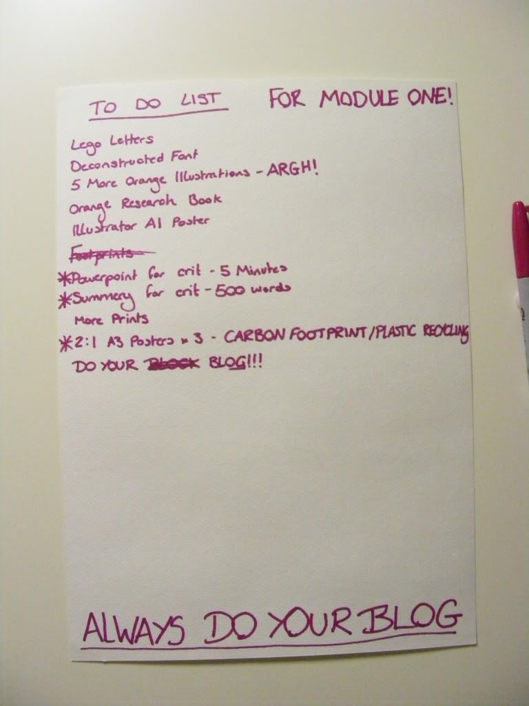
I'm aware that I only have five images here. There were five 15 x 15 auqares with just text in them, but during our crit, I discovered that the images worked better without the text, so I decided not to load them up. The original plan was to have ten illustrations anyway, but we were only give five days for the project and well, there just wasn't enough time. I do intend to complete it, and do five more illustrations before the module deadline sometime in November. Man I am swamped right now.

The process of putting up the images. Excuse the bad quality, I didn't have the flash on my camera and so it wasn't too steady.

The top half of the board, mine's in the top left hand corner. Complete with text squares.

The bottom half of the board. I do love the pumpkins.

Adios. x