His style of working is the complete opposite of mine. Whereas my work is very messy and thrown on, I work with a lot of paint and inks and love to get really hands on with my work. I love traditional media. His work is very precise, and neat, and perfectly aligned. I can see why he calls himself a perfectionist.
My first idea was to try and combine our two styles, trying to create a controlled mess within a perfectly aligned space, but it simply wasn't happening. Another idea was to use the word shy, and to have Carl's name in small letters, in the corner of a block of bright colour. But during the crit we decided that that wasn't Carl at all, so the idea was scrapped.
Inspiration struck at the fact that video gamer was on both of our lists, so I decided to go back and look at the pixellated fonts used within videogames, especially retro ones.
You can't get much more retro than Space Invaders.
 Tadaa. Personally, I love it. I know that it can't be seen all too well in the photograph but the Illustrator version will be up soon enough and you'll be able to see it in all it's true glory. I wanted to fill in the blocks, but I wasn't sure what media to use. Pen would have left it too streaky, and I spent far too long aligning it all dead centre and tracing it perfectly to ruin it with paint. That and my sucky time management skills came into play.
Also, I actually did the wrong glyphs. I forgot which ones Amber drew up for us to do, and just went with it really. I know that the @ was supposed to be included, but it doesn't easily translate into pixels. I'll work on that one some more and maybe have it as the Mother Monster at the top of the Space Invaders game. Oh the ideas.
I wanted to show it as a part of the game itself so that the theme became even more apparent. Pixel font is generally associated with video games, especially older ones. Besides, who doesn't know what Space Invaders is?
I did do a coloured version on Illustrator, but it looked a lot more like Tetris, and went along that line, but you'll see that later because that's a whole other story.
 Carl's font for me. Personally, I really like it. It was completely different to everyone else's in the fact that he hadn't used actual letterforms. It's almost like a Dingbats font in a way, still an alphabet, but almost entirely unreadable. Except to Carl who spent so long staring at it he claims he can read it now. Crazy world. Anyway, I love it, and really think that it shows me. That is my kind of style, only more messy and uncontrolled. It's almost like he tried to combine both of our styles into one, like, a controlled mess. Whereas I didn't achieve that, he really did and it just works. I love it, though a key would be useful, especially when it comes to the punctuation.
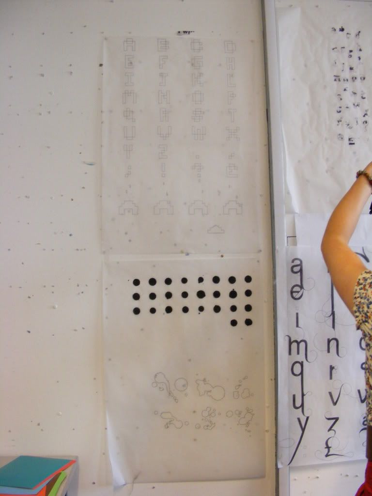 Shoddy quality picture I know, but mine and Carl's typefaces together just after the presentation. We had to go first, but according to Tom we 'set the bar' so I guess it wasn't a bad thing.
X
No comments:
Post a Comment