Saturday 28 February 2009

Typography

During playing around with type for the latest brief, for which I am submitting to the Don't Panic poster competition. I'll have another blog post on this project at some point soon, but at the moment I' just focusing on type.

I never had a chance to work with typography before I came to LCAD, and honestly, I didn't know anything about it.

I was messing around with a Plato quote that I was using for the poster, just to see what kind of typefaces I could produce by playing around with brushes and lines.


The above two images were made using paint brushes in Illustrator. I really like how messy and scrappy they turned out, but they are still completely readable, unlike some of the results that I came out with.

This image below was clearly made using the dotted lines and scissor marks that we see on an image that needs cutting out. Because there were so many lines and corners in the actual type, it went a little crazy, but I think it looks good. It's still readable, thought interesting to look at.
The image below is my favourite. I accidently created it using one of those page divider deals on Illustrator, and it went crazy but I really like how it looks. I'm going to play around a lot more with type in future now that I realise just how I can make type far more interesting.


-HJ x

Wednesday 25 February 2009

The Dark Crystal

Now, I don't know how many of you have seen The Dark Crystal, but it's very good. Very strange, but I enjoyed it a lot, and would recommend watching it. It's like, twisted Muppets, and it was done by the same guy. Though I'm not sure whether this or the muppets came first. Anyway.

It's kind of like Labyrinth, which was also done by Jim Henson, but Labyrinth freaked me out a lot as a kid. Also, I get Legend and Labyrinth mixed up quite a lot.

I found this book in my room, because the living room at home is being redecorated, so all of her books, and there are a lot, are being kept in my room. She has some awesome books, and got quite a few art books like this when she was younger, I love rifling through them.

This is the concept art book for The Dark Crystal, illustrated by Brian Froud. There are some truly beautiful illustrations in it. It was printed in 1982, so it's older than I am!


Some of the images are on tracing paper so they form more intricate designs with the images behind them. I think that it's a fantastic idea, really, laying images up like that, and both images look great alone as well as together. This Brian Froud character is a very talented man.


My feet in the last one, hah. Oops. Anyway, if you haven't seen this movie, I suggest you do, or try find the book somewhere to look at. Or just look up Brian Froud's work.

Sunday 15 February 2009

American election VOTE posters.

I found this treasure trove of voting posters for the US election. A design company called AIGA invited designers to take a part in their campaign of creating posters that would inspire and encourage people to vote. Because so many Americans just don't bother (not that it matters, most votes don't count. Only certain states' votes really count). There are hundreds of entries on the site, and I trawled through them all, picking out my favourites to post on here.

The above poster was created by Mary Meiners to highlight all of the excuses that people use as to why they didn't vote. It's very interesting to look at and aesthetically pleasing. All that jumbled up text just makes me want to lean in and work out what all of them say.


This poster was created by Zach Norman with the phrase 'Use your voice'.
Unfortunately, this one has been removed from the sight and so I can't tell you who the designer is. It's one of my favourites though.

This design was sent in by Scott Brucato with the phrase 'Thing about it'.

Emily Green designed this one to spread the message that 'we need a leader that understands all of our needs and that the environment is one of them.'

This has since been removed from the sight and I really can't remember who designed this, I love it though. Picking out the letters in a brighter colour to draw attention to them is a sure way to bring the eye in and grab attention.

This one was designed by Will Ecke, and I think that this is one of my favourites. It's very simple, and the way that the two animal representatives have been combined to create a heart is excellent and aesthetically pleasing.

The site where all of the other designs are is here.

-HJ x

Friday 13 February 2009

Book of 100

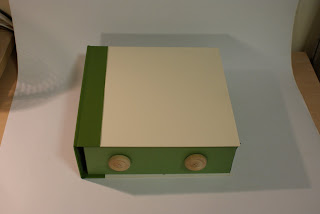
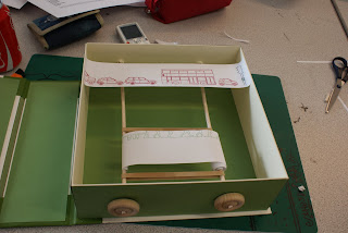
This is the final resolution that was made for the book of 100 brief. I wanted a box that looked like a book, as you can see. I bound it like a book, and to be honest, I'm really pleased with how the box turned out. My first attempt at making a box didn't work at all, and I managed to superglue my work to the table, but it was soon rectified. My flatmate told me that I should just make these boxes and sell them. I think she wants one.


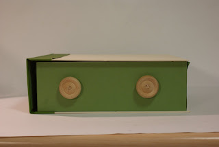
The wooden wheels on the side, which are actually wagon wheels for doll house vehicles or whatever, are the turning mechanism for the 'scroll' type book inside. I had to make the holes of the wheels a little wider by scraping the inside of a pair of scissors. Easier than I imagined it would be.

Anyway, I thought that the wood looked good against the green and cream coloured box, and seemed to fit in with the whole feel of 'green'. Green as in eco-friendly. Despite using wood not really being the most eco friendly thing to use. Aesthetically it works, however.


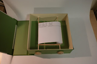
This is the inside of the box, and as you can see, this is the first version of the 'scroll' book I made. It was very long, my illustration took up about..25 A4 pages altogether, I believe. During a crit, the one on the day before the deadline in fact, A lot of people felt that it was far too long, and they didn't get what the cars had anything to do with anything. They got bored with turning it about halfway though, so I bought some Pro Plus and got cracking as soon as I got home. It was a long night.


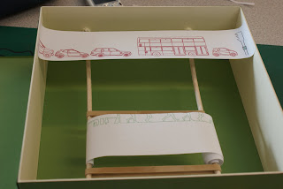
And this is the second attempt at the scroll mechanism within the box. I changed it quite a lot, and made it much shorter. I didn't take anything out, I just shrank everything down so it covered about eight pages instead. Another thing I did, was I removed the car illustrations and put them in a seperate line, which I coloured red, which indicates several things. First, it imitates the red light which is keeping all the cars stationary and stuck in a traffic jam, and second, red is a colour that connotes the bad things in life.

Which is why the figure dancing around is coloured green, because the green is good and better for the environment, as well as the signal for go. This time, only the figures are on scrolls, because while they move from side to side, the car illustration can't physically move anymore, meaning it's stuck while the person has the freedom of movement. That was what I intended, at least.


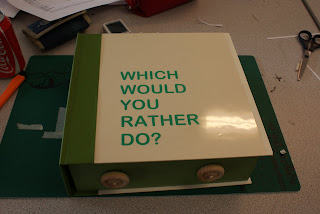
This is the cover of the book. My original intention was to have the 'Green Person' aka, the walk signal, sprayed onto the front cover, but I chose against it. I used this question instead, because posing a question to the viewer automatically asks their opinion and makes them curious as to how to answer it. That is my way of getting people to look at this book. I was going to spray paint this onto the front cover, but I ran out of time and had to stick a piece of acetate on instead.


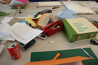
This is my workstation on the day of the deadline, hah. Caffeine, Sausage roll...what a way to start the day.


The turning mechanism was not as smooth as I would have hoped for, but I feel that it was the best that I could managed with my limited tools and limited experience with making such things. That, and actually spray painting the cover of the book, are the main things that I would change about this design had I had a little more time, but overall, I'm pleased with the result.

-HJ x

What is Line? UV.

More light experiments using UV!


My room all lit up in UV, how pretty.To be honest, being that I messed around with using light in the book project...I'm getting kind of bored with it. Sorry to say.

-HJ x

Photoshop Book

Just like before, with the Illustrator brief, we had several sessions on Photoshop and InDesign with one of the computer technicians, called James. Going along with the book theme for this module, we had to create a 16 page booklet on what we have learned so far on this course.

This is the front and back cover of the book.
Images from the Mono Print workshop.

And from the Screen Print workshop.

Things I have learned to do in Adobe Illustrator.

Bookbinding.

A little more on bookbinding and some examples of the different techniques.

Examples from Visual Language sessions with Amber.

And a page on Time Management that we have been covering with Jo.
It was very simple, altogether, but I think that's fine because there was no need to over complicate things. I like the way the book turned out, althought I didn't read the brief properly apparently, and made the book A5, when it had to be A6. So there was a mad dash to the Mac Suite on the day of the deadline. I managed.

-HJ x

Module 102 Evaluation

BA (Hons.) GRAPHIC DESIGN LEVEL 01
Module Code OUGD102
Module Title DESIGN PROCESS


END OF MODULE SELF-EVALUATION

NAME HANNAH JACKSON BLOG. ADDRESS HANNAHJACKSONBAGD.BLOGSPOT.COM

1. What practical skills have you developed through this module and how effectively do you think you have applied them?

During this module I have learnt a lot about book binding and I feel that I have applied this newfound skill quite well throughout this module.


2. What approaches to/methods of problem solving have you developed and how have they informed your design development process?

I have begun to let my research and development guide my work rather than having an idea to start with, though I do need to get my mind off the final resolution.


3. What strengths can you identify in your work and how have/will you capitalise on these?

Illustration seems o be one of my stronger points within this particular module, this is something I would like to experiment further with.


4. What weaknesses can you identify in your work and how will you address these more fully?
Doing things in the right order is one of my weaknesses, I can’t seem to break my habit of working towards a final resolution rather than experimenting more in my development work and letting that lead me.
I also need to do more thorough research.


5. Identify five things that you will do differently next time and what do you expect to gain from doing these?

1. More thorough research.
2. More development before I choose an idea.
3. Manage time better.
4. More mock ups.
5. Not take on too much.


6.How would you grade yourself on the following areas:
(please indicate using an ‘x’)

5= excellent, 4 = very good, 3 = good, 2 = average, 1 = poor
1 2 3 4 5
Attendance 5
Punctuality 5
Motivation 3
Commitment 4
Quantity of work produced 3
Quality of work produced 4
Contribution to the group 4

The evaluation of your work is an important part of the assessment criteria and represents a percentage of the overall grade. It is essential that you give yourself enough time to complete your written evaluation fully and with appropriate depth and level of self-reflection. If you have any questions relating to the self-evaluation process speak to a member of staff as soon as possible.

Thursday 12 February 2009

What is a Line? - Lightmark

The following images were created by Cenci Goepel and Jens Warnecke, and were found on a website called Lightmark. Their work often takes place in remote, sparse places, in which their beautiful trails of light often look very surreal and sometimes very alien looking.


Using this as inspiration, I plan to move away from creating letterforms and experiment more with shapes and curved lines to see what kind of outcomes I can come up with. I have chosen to look at this technique because it is an interesting way of 'painting' without actually making any marks.

-HJ x

What is a Line? - Kyle Webster

Kyle Webster is an artist I stumbled across whilst hanging out on ffffound.com. He has a blog called 'The Daily Figure' and obviously, he draws a figure a day, well, almost every day. It does almost exactly what it says on the tin. He uses no reference for these drawings, and completes them in a matter of moments. They are very simplistic and beautiful, almost using continuous line but not quite. He uses them as an exercise to perfect his develop his figure drawing skills.


I would love to be able to do an exercise like this to perfect my drawing skills, but at the moment I simply do not have time, and that sucks quite a lot. Another day, though.

-HJ x

Sunday 1 February 2009

32 Page Book of 100.

After collecting all of our research on the subject of choice, which for me was movement. In hindsight I wish I'd done something different, it took me a while to come up with this idea. We had to somehow put our 100 things into a book of 32 pages. Granted, I didn't have quite 100, but I still like how the book turned out.

This first picture is from the early pages of the book, and to demonstrate a form of movement, I wrote the words in the dark using a torch. It took a while to get right. Each word is actually a different picture that I meshed together to make the sentence. I blacked out my window and set my camera on the tripod and went mad really.

This is another example of light moving, that I created with my camera on the tripod with a 30 second shutter speed. The lights and light trails were caused by me throwing glowsticks at the wall from behind the camera. I really like how the image turned out, and got some really interesting shots.
Such as these:
The idea of my book was to document movement as a 'how to draw' guide. So I took pictures of the stages of movements with my flatmates, who were very helpful, and then put them on the lightbox and created simple line sketches. I would have lined them properly in Illustrator, but time management was a bit of an issue at the time, so I didn't. I think they still look okay though.This is a collection of the images of the finished book, showing each double page spread. The print quality wasn't amazing, because I just printed it out on the printer in my room. It's good, but it's not that good. Anyway, it seemed to get a good response. People liked it.
I'd like to re-do it with illustrator smooth images and decent prints, but that's a task for another day.

-HJ x