Monday, 26 January 2009
Durex Balloon Animals
One of the best adverts I have ever seen, no joke. Don't click if you're under eighteen. Oh God
Thursday, 22 January 2009
Concertina Exercise.
Okay, so this was an exercise that we did with Jo on Monday afternoon, it was interesting for sure. We folded up strips of paper into Concertina style books, and had to put the title of the books we had made over the week in the first box in some visually exciting way using type. Then we would pass it along to the person on our left and they would fill in the next box, and so it would go around the table until it was full. I think Martin was doing very well considoring his right arm is in plaster and he's right handed.

 The ones below were another strip of paper, though this time we had to use images, we spent like, two minutes on each frame. Once they'd all gone around, they went around again, and we had a minute to work on top of someone else's drawing and add to it. That was pretty interesting.

 I don't know how Disco Stu ended up on mine.
-HJ x

 The ones below were another strip of paper, though this time we had to use images, we spent like, two minutes on each frame. Once they'd all gone around, they went around again, and we had a minute to work on top of someone else's drawing and add to it. That was pretty interesting.
 I don't know how Disco Stu ended up on mine.
-HJ x
Visual Studies
Okay! So in the first week back, during Visual Language we looked at Perstective and Tone with Lorenzo. Pretty cool. The first thing we had to do was try and create the perfect cube, as seen below. Mine is a little too tall, I think, it's very pointed towards the edge too, but still, not bad for a first attempt. Pretty good technique too, I'm gonna practice this one.

And then, from there, we had to do our initials, and using the same technique, make them 3D. Now, I only have two initials, so I added an A on the end for a little more practice. I think it turned out pretty good. I want some of these grey markers, they were pretty nifty.
 And the week after we did perspective and tone, we were looking at schematics. I might have spelled that wrong. Anyway, I chose to illustrate the story of posting a letter in ocon form, making them as simple as possible. The journey goes as such. Put letter in envelope, write address, lick envelope, stick on stamp, bike to post box, post letter. Job done!
I think it worked well, because it was really easy to read the my classmates got what it was instantly, which was the goal. I wanna work more with this kind of thing as well as refine this one. Maybe do it in Illustrator or something.
 I'll post it on here when I do.
-HJ x
Friday, 16 January 2009
I HAS BOOK
Look at that, I made that all by myself today in the Book Binding workshop with Printroom Roger. It took most of the day, I never really realised how much went into making a book, it's a lot more complex than you'd think!
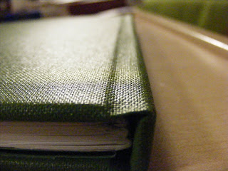 Anyhow, I really enjoyed the workshop today and I'm well proud of the book I managed to make, I mean, seriously, not bad for a first attempt. I've always wanted to know how to do this, so it's a skill I definately wanna work on. I want to try all different kinds of binding methods and see what I can do.
 I'd quite like to try making a book without a hard spine like that, where you can see the stitching and the cover is just sewn right onto it, but it looks like that'll be a project for another day, because I have to have a 32 page book ready for Monday. I should be able to manage that, I hope, and thankfully it doesn't have to be bound like this.
 By the way, this is referred to as 'Perfect Binding'. Mine's not perfect but with practice, I could get this down just right.
-HJ x
MORE WHAT IS A BOOK
Tortie Rye is responsible for the creation of the below books, except, some of them I'm fairly sure she just modified existing books, I could be wrong. The little round things in the picture below are described as 'Cactus Books', and unfold into, obviously, a cactus like structure. Aren't they cute? These are bauble decorations, but are still classed as books and are aptly names 'Bauble Books' again by Tortie Rye. They're very nice to look at, though from the picture I can guess that there is no text in these 'books'? Meaning that they are purely for aesthetic value.
Still lovely though.

Literal Book Bags
I remember seeing a tutorial on some forum or another on how to turn a book into a handbag, so I went looking for them and found this example on a website called 'The Bag Lady'. I assume she sells bags. Anyway, it's a good way of creating an interesting looking bag, and recycling a hard back book. If only I was a handbag carrying person, I would go and raid the nearest charity shop of their interesting covers and go completely nuts.

The following images are the work of Brian Dettmer, and they are referred to as 'Book Autopsies'. Sounds pretty morbid, but they look completely fascinating. I'm not even sure how he does some of them, but the end result is pretty interesting.


 I'm not too clear on their 'readability', but they are still definately books.
-HJ x
 These are bauble decorations, but are still classed as books and are aptly names 'Bauble Books' again by Tortie Rye. They're very nice to look at, though from the picture I can guess that there is no text in these 'books'? Meaning that they are purely for aesthetic value.
Still lovely though.

Literal Book Bags
I remember seeing a tutorial on some forum or another on how to turn a book into a handbag, so I went looking for them and found this example on a website called 'The Bag Lady'. I assume she sells bags. Anyway, it's a good way of creating an interesting looking bag, and recycling a hard back book. If only I was a handbag carrying person, I would go and raid the nearest charity shop of their interesting covers and go completely nuts.

The following images are the work of Brian Dettmer, and they are referred to as 'Book Autopsies'. Sounds pretty morbid, but they look completely fascinating. I'm not even sure how he does some of them, but the end result is pretty interesting.


 I'm not too clear on their 'readability', but they are still definately books.
-HJ x
Thursday, 15 January 2009
What is Line? Jackson Pollock.
Now, I have a Fine Art A-Level, and I think it's that what has led me in this painty direction for What is Line. I enjoy painting. I'm not very good at it, but that doesn't really matter for this style of painting. Which I like to call, making a mess.
Mess is definately my thing, I'm good at that.
Anyhow, I've been looking into the term 'Action painting'.
"Action painting, sometimes called "gestural abstraction", is a style of painting in which paint is spontaneously dribbled, splashed or smeared onto the canvas, rather than being carefully applied. The resulting work often emphasizes the physical act of painting itself as an essential aspect of the finished work or concern of its artist." - Wikipedia
One of the most famous 'Action painters' is of course, Jackson Pollock.
Here he is. Doing his thing.
 Now...to be honest, I don't like Pollock's work. I'd go as far as to say that I dislike it intensely. Hate's a strong word, y'all.
But for example, the image below? Picture the roof of a caravan that wasn't been washed in some time. Remind you of the build up of bird crap? I thought so.
 This one, I suppose, isn't too bad, but it's very dark and depressing, which obviously, Jackson Pollock was himself, so it clearly reflected on his moods and such.
 While I don't like his work, I like the way he works, make marks by throwing paint around and drizzling it from sticks and such. Sometimes, he didn't even use paint brushes! And this is mainly what has inspired me to try as many different techniques that I can think of to make marks, lines specifically, without me ever touching the paper.
-HJ x
Monday, 12 January 2009
Lichtfaktor
This video by Lichtfaktor is one of the best pieces of light graffiti I have found, and is my favorite. It is truly amazing and must have taken a lot of work. I love how the light fight was created, and would love to try something like this, though time may prove to be a bit of an issue. Oh well, I do have all reading week to work on this!
Monday, 5 January 2009
WHAT IS A BOOK?
Emily An.
Yes, these are books, despite what they seem. They are constructed from Newspaper or magazine pages, and represent just how much of a tree it takes to make just one newspaper or magazine.
 Although there is an obvious centre, and in some images a spine is clearly seen, I'm not sure that these 'books' were meant for reading. I don't know about anyone else, but I for one would probably not be able to get the thing back into the bark exterior.
In the image below, the middle 'book' is to represent The Yellow Pages. Look at how much paper that is!

 As well as being interesting, and one of the most unique forms of books that I've ever seen, I think that they are very clever. It really hammers it home, to me at least, just how much paper is used to create one publication, that we later throw out.
I've become a bit of a recycling fiend lately anyway.

Su Blackwell.
Blackwell creates scenes from books, by cutting them out and creating 3D models from the pages. It's sort of like a wierd form of pop-up, except I don't think that you can close the books. It's an interesting way of altering a book, however. As we can see in the image below, a scene from Alice Through The Looking Glass has been created, using cut outs from pictures as well as models fashioned from other pages in the books.
 And the image below depicts a forest, though this one looks a little flatter than the ATTLG one, for instance there is not chair made from a solid block of paper. These seem to be flat trees pushed up from the pages. No less interesting, however.
 It kind of reminds me of that one scene from The Three Musketeers? When Aramis flipped open his bible to reveal a gun hidden in there from the pages being carved out around it? Nifty hiding place.
-HJ x
Sunday, 4 January 2009
Packaging Design
So I've been lurking around lately, and really, I haven't gotten a lot of work done at home yet.Some, but not an extensive amount. I'm a little umotivated and spend my days watching Miami Ink. Plus, Santa brought me the flu for christmas and that kind of knocked me out. Anyway, here's some awesome packaging design that I've discovered during my surfing.
 Andy Mangold redesigned the Monopoly packaging, and I think it looks so much better. It looks much classier and suits such a classic game, rather than the gaudy packaging that we often see the game in. You can see the details and the rest of the redesign here.
 This packaging for baby converse was designed by Ronny Poon. Personally, I love the lace up detail on the box, and according to the designer, provides some form of child learning benefit. A quote from the designer is:
"A fun package for toddlers’ Converse shoes. It helps improve children’s motor skills by allowing the child to lace-up the box. When 5 boxes are collected they can be placed together to form the Converse star."
I can't see a toddler needing five pairs of Chucks, but fair enough. I thought it was aesthetically pleasing.


 This is possibly the best condom packaging I have ever seen in my life. This design was entered into the Sex & Sundhed packaging competition by Mads Jakob Poulsen and Robert Nagy. It's simple and humorous, and well, it gets the message across.
-HJ x
Subscribe to:
Posts (Atom)