Wednesday, 17 December 2008

What if...? SELF EVALUATION

What if…? – SELF EVALUATION


What problem did you identify?

The texture of fresh fruit is preventing people from getting their ‘5-a-day’.

What evidence did you find to support your decisions?

Facts and statistics about many people failing to meet the 5-a-day target.

What methods did you use to gather your evidence and what forms did it take?

Primary/Quantitative/Qualitative – Surveys, Questionnaires.

Secondary/Qualititative – Articles

Secondary/Quantitative – Statistics

What methods did you find useful and why?

The initial survey that we did was very useful as it backed up our problem and allowed us to move forward.

How did these inform the response to your problem?

By knowing that the majority of people we asked said that the texture of fruit affected their five-a-day intake, we decided that the next step would be to inform people of the alternatives to fresh fruit that also count towards their five-a-day.

What methods did you find problematic?

-

How did you overcome this? How will you address these issues in the future?

-

What research didn’t you carry out that would have proved successful?

We could have gotten some qualitative primary research by asking people to elaborate on the particular fruits they had problems with.

What five things would you do differently next time?

-Taken the solution out into the public domain.

-Asked people to elaborate on why texture affected their 5-a-day intake.

-

-

-

List five things you have learned about the design process over the past 2 weeks.

-The difference between Qualitative and Quantitative research.

-Thorough research is very important.

-Working blind is scary but worthwhile.

-Without research I will do a resolution in a style that I am comfortable with.

-Doing a resolution and then going back to do the research is not a good process.

-HJ x

Tuesday, 16 December 2008

Oh I'm ready for it.

Come on, bring it Christmas. I'm ready for it.

TYPOGATEAUX

Okay, so. Leigh and I teamed up to do the Typogateaux project together. Because we're both awesome and all that jazz. Anyway. This is the documentation of the process. It was a fun and messy process too.

Leigh making cake batter.Me taking my turn at stirring.
Mmm...
Easy, Leigh.
Mmm...doesn't look that appetizing...

Into the oven with you!
Eating the leftovers, mmm.
The result. A little burned but...this was just a practice cake!

This is what was salvaged from it. Still tasted good.

The second attempt. Much softer and generally better done.

Cut into letterforms...
The base cake batter!
Mmm, making the icing. What a tiring job.
Icing the letters.
Still...icing the letters.
The base cake! Now that looks like some good cake.

Icing the base cake.
Making a mess while I'm at it, too.

Sticking the letters into the icing.
And this is after I painted the letters with food colouring and added the black lines! Tetris! Or at least, the best that we could do. I'm well chuffed.


And now it's sitting in the fridge, waiting to be taken in on thursday. Job well done!

-HJ x

Friday, 12 December 2008

Carl's Illustrator Poster...

Awww

Seriously, how nice is that? The illustrator version of the font he made for me. He gave it to me with my namebadge as a christmas present, and I gave him the one I made for him. Awww.

I told you I'd stick it up, Carl!

-HJ x

I JUST FOUND THIS PICTURE

That's me in about....ooh, 2006? Age 16. I would have said younger, but that's my film SLR so it was during AS levels. That's in Cyprus, and I was on a mountain and it was cold. Hence the hoodie. My dad took this when I, clearly, wasn't paying attention, haha.Look at that mad rad hair!

-HJ x

WHAT IF...?

Alriiiight, so, another group project, this time working with Emma, Gareth and Mille. The point of this project is to teach us to work more with our research, and let process drive the outcome, rather than have an outcome in mind. That was we only end up doing things that we've done before. Doing a project and not knowing what the final outcome will be is a little bit wierd, though I guess it worked out okay.

At first we were dealing with texture and personality, though it was a difficult concept, and so we went on to deal with the problem that people aren't getting their five-a-day because they don't like the texture of certain fruits. We did a survey amongst the class to confirm this.

This is a series of macro shots looking at the texture of both the skin and the flesh of certain fruit. It looks all interesting, and nice. Our solution turned out to be a way to make people realise that there are alternatives to fresh fruit that still contribute to their five-a-day, and we took it upon ourselves to make people aware of this. This came in the form of a fruit stall, offering alternatives to fresh fruit such as dried fruit and fruit juice. The pictures below recorded the experience.

This proved to be pretty successful, and the fruit went kinda fast. I mean, what right-minded student would say no to free food? Not I. Anyway, we had a survey to fill out again asking people if they found anything new they liked and if it would contribute to their five a day, and 'yes's outweighed the 'no's by a mile. I would call that a success,

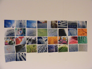
This is all out research and recordings pinned to the wall for the crit this afternoon. I'd say we got a fair bit of work done. A lot more than we did for the last group project that's for sure.

I feel I'm already evolving as a designer.

-HJ x

Mario Kart Song


I'm spreading the love, despite it not being Graphic Design related.

-HJ x

Wednesday, 10 December 2008

Technically not graphic design but...

I just made soap! This is my first attempt at it, and this side of it looks really good! (It's wrapped in clingfilm, by the way, it's not actually got white bits on it.) The other side, which was the top, looks kind of dodgy because I heated it up too much. Oh well, first attempt though! Not bad, if I do say so myself.

Mmm...honey and lemon scented.

-HJ x

Tuesday, 9 December 2008

Human Numerals

A continuation of the 'number one' theme that I was giving during visual language. Human numerals! Hurrah!

What a lovely expression, Carl :]


Beautiful expression, Ed Webb.


Clearly, there wasn't a lot of room in the classroom, so you can't see some people's feet, but we had to make do, so. Still pretty amusing.

Leigh! Haha. Look at you all bein' an X.

I wanna do this again, but properly, where you can see people's feet and everything. That could be quite good.

-HJ x

Visual Language Week 5: Ones

On this session, everybody in the room was given an object, letter or number to gather from around the classroom. We weren't allowed to leave the studio, so all of our things had to be sourced from the classroom. As you can see, I got the number one, and there aren't that many of them in the studio. Plus, I left my camera on my bed and had to borrow Leigh's when she wasn't using it. Isn't she nice?


There were a few more, but nothing really amazing, just tiny, pathetic excuses for numbers so I just threw these up.

-HJ x

Visual Language week 4

So I'm completely running behind on this, please bear with me.
We did this on week four of Visual Language with Amber, which was a while ago, I know. I'm catching up now.


So yes, A2 sheet of paper divided into 16 sections. Amber called out words to us for us to visually represent, as well as giving us different times for each one, ranging from thirty seconds to ten minutes, I think. Once we'd done one on our own sheet, we'd go to someone else's sheet and do the next word on their's, while someone else did one on mine, and then we'd go back to our own and do another one, so on and so forth. Unfortunately, I don't remember what the words were for each one, but I do know that the Batman related box was to represent George Clooney. I did that one and it's my favourite. I also like the cow that Leigh drew for me.

I didn't have my camera with me during the session, so I didn't get pictures of anyone else's, but trust me when I say there were some good ones out there!

-HJ x

100 Photographs

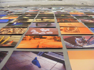
The first brief of the new module was to take 100 photographs in a week, and have them all printed and cut out ready for the studio session. Not that hard, you might think, but it was more difficult to take 100 photographs than I actually thought. I think I did okay though. 100 exactly!
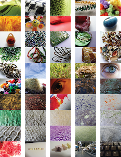
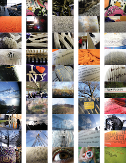
The subjects were: People, Objects, Places, Text and Textures. I had a lot of textures, because that's an interest of mine anyway. I love texture.

Anyway, then we were split into groups, me, Will, Gareth and Hanna G. It was a good team.
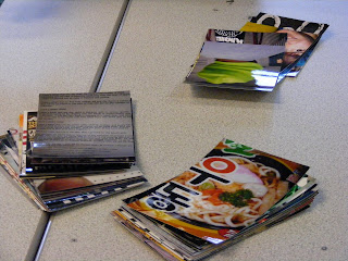

We split them into piles of each category.
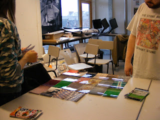

And then tried to work out a way of arranging them with one another's in a pattern that made sense.
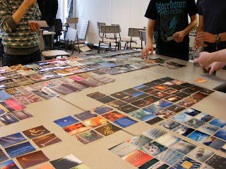
We tried to fit all of them on the table space that we had, but clearly that wasn't happening. Hanna and Gareth's were the same size, so we let them have the table, and me and Will took ours to the floor. Which seemed to work out quite well for us.
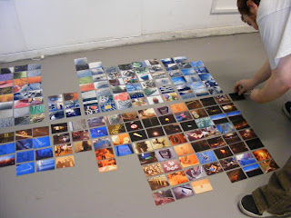
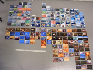
I really like the way that we laid ours out. It just worked really well, and worked together as well as individually. The themes go, from left to right: Textures (5 columns), People (2 columns), Text (2 columns), Objects (4 columns), and Places (3 columns).
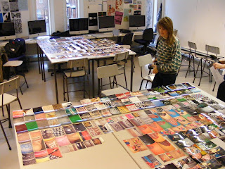
A couple of examples of how other people in the room were working and laying theirs out.

Next, we were given the names from another group, and had to go and rearrange their photographs into some kind of order. We had Dan Boom(e?) and Gavin Drury.

Dan's:
This is how it started. It was kind of hard to categorize. There were a lot of train pictures, and pictures of plants near a train station, and then some shoes and then Matt (Milner?). Will and I started categorizing from green to not so green, but we kept changing our minds. We ended up doing from the wilderness to civilisation. Or, the beginning and end of Leeds. Ending in Matt.
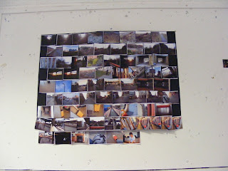
This is what it looked like by the time that we were done with it. It kept falling off the wall though.

Gavin didn't have any photographs, so we took on the mammoth task of Tom Cummings. Don't ever try to categorize Tom, it's just, really hard.
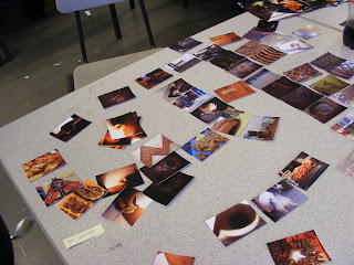
Looking through his photographs, which were all really random in relation to one another, we struggled to find some way to categorize them. We came up with the idea of from Tom to not Tom, but that proved to be too difficult. We ended up going from crazy colours to dull colours.
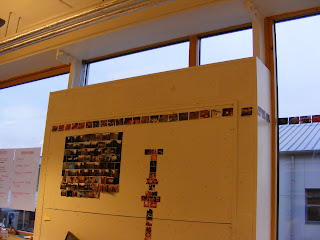

It starts out running along the top of the board and around the corner...
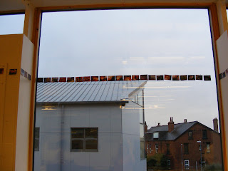
And keeps going across the window, and around another corner...
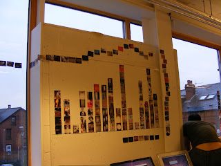
...and onto the other board, working around other people's work and down the other side and doubling back on itself along the bottom. I think that the way we laid it out even represented Tom. It started off neat, ended...well, you can see how it ended. Later, when we had to write down ten words that coupld possibly represent our work, Tom made the mistake of writing his name on the sheet, and everyone ticked that instead of the actual options. I thought it was pretty Tom.

Back into the other room to see what had been done to my work.
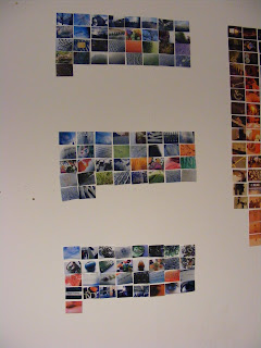
Dan and Gavin had arranged it from rough to smooth, starting with the roughest textures at the top, and the smoothest at the bottom.
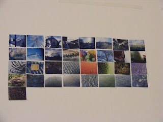
The top third containing the rougher textures.The middle textures.And the smoother ones, ending in a nice smooth ribbon. This was a good way of categorizing my work, I wouldn't have thought of that. All in all! A wierd but pretty good day.

-HJ x